【無了期唔知幾時完嘅武漢肺炎】國際疫情討論區09
麻木青年
5001 回覆
47 Like
7 Dislike
Even the name of this post 無了期唔知幾時完 you created is super high standard. You foresee this pandemic will last very long.
When I joined this 討論區, people at here already knew that the number sof new cases and new deaths are usually lower on Sunday and Monday because of the fewer people worked in the laboratories and hospitals on Saturday and Sunday. They even noticed that the number of new cases is also lower at the beginning of a week and tends to increase toward the weekend.
I want to emphasize the above paragraph because some people believe incorrectly that I am the first person knew the above. I am NOT the one who discovered the above observation, although I coined the name Sunday/Monday effect for this observation and I may be the first in the world to use the 7-day moving average to eliminate this effect from the data. There were a lot of capable people in this 討論區 in the early days.
I want to emphasize the above paragraph because some people believe incorrectly that I am the first person knew the above. I am NOT the one who discovered the above observation, although I coined the name Sunday/Monday effect for this observation and I may be the first in the world to use the 7-day moving average to eliminate this effect from the data. There were a lot of capable people in this 討論區 in the early days.
I need to end up this discussion because people lost their interest to this topic nowadays. 
Thanks for your support and understanding

Thanks for your support and understanding

At that moment, the discussions in 討論區 has been slowed down a lot. This did NOT mean the 討論區 was slow, actually it was very fast. But the 討論區 01 to 04 were ultra super fast.
It was still very fast because we talked about a lot of topics which were not related to the 疫情. This was because we just wrote something while we waited for the data given by some countries.
The second reason that 討論區 05 and 06 were still very fast was the pushes from those people who hated the 討論區. They wrote a lot, such as 武漢肺炎 is just a flu. This triggered the debates and pushed 討論區 05 and 06. The end result was that they were the largest force to push 國際疫情討論區 forward, although they wanted us to stop talking about the pandemic and we would abandon 國際疫情討論區.
One member has collected the data and used polynomial curves to fit the data using Excel. He tried to use these curves to predict the future of the pandemic. He posted a lot of graphs at 國際疫情討論區 as well as other posts at LIHKG. Some members at 國際疫情討論區 praised his work. However, some members in other posts said his work was rubbish. His work is actual no good so I ignored his graphs and said nothing at first. Later, with his great effort, I thought he may be a postgraduate student doing the research on COVID-19 so that I told him politely that his work was not competitive (against the works done by big organization). I have also shown him some of the works based on Big Data. I have also told him that almost all the professors have instructed their postgraduate students to stay away from such a hot topic, COVID-19. A few week later, he no longer posted his graphs at 國際疫情討論區 . However, he has still posted his graphs in other posts at LIHKG. Partly because the attacks from members in other posts, he finally gave up and no longer posted his graph at LIHKG. He was one of the main force to push 國際疫情討論區 forward.
However, our later discussions were about write Visual Basic Applications programs in Excel, and the discussions might have turned some members away from 國際疫情討論區 .
I hope he is still reading this post because I want to write down the faults of his work here:
1. There are no reasons the trend of the new cases should follow polynomial curves. Actually, for a single wave, the graph is more likely to be Gaussian.
2. One cannot predict the future in, say Autumn, by using data in Spring. His approach may work if he has at least a fuller year data and use the data in past Autumn(s) to predict what will happen next Autumn. Even so, the prediction can easily be wrong because of other factors such as new variate of virus and the change of government's policy.
The main point in the above is that the slow down has started as early as in 討論區 05 and 06.
I hope 樓主 or others can tell us how come 討論區 01 to 04 can be finished in such lightning fast speed.
39,849 new cases and 1,163 new deaths (new national record) in Russia
Actually, thank you for your friendship!
Also, I remember that one day last year you posted a comment here to ask us to save a girl. The friends of that girl was worrying that the girl might want to hurt or even kill herself and she was missing. Her friends asked all of us at LIHKG to find that girl.
You, I and a few others leave this 國際疫情討論區 and went to push other posts that asked all LIHKG's members near that region to find that girl.
Finally, someone found that girl and save her. Therefore, 國際疫情討論區 has provided help to save that girl.
From my personal point of view, this event is the most important event happened at 國際疫情討論區.
4,899 new cases and 56 new deaths in Vietnam
Keep worsening.
Keep worsening.
【最新】食環署:下周一起公眾街市、熟食市場等要用「安心出行」應用程式,公廁、靈灰安置所等無須使用
https://lihkg.com/thread/2755103/page/1
https://lihkg.com/thread/2755103/page/1
Oh, i almost forgot it 
It was a good memories for us, I’ll remember this day.
We did something

It was a good memories for us, I’ll remember this day.
We did something

For your information, I did created a gaussian curve. The polynomial function is just part of the process as Excel does not have a straight forward to estimate it.
In fact, it is pretty accurate to predict the trend using the data before 4 May for India as the government did not have any measures to stop the virus.
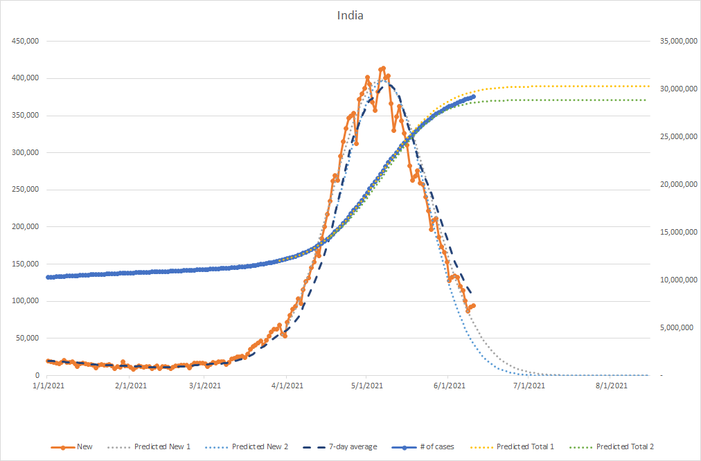
I stopped tracking everything as I knew vaccine will change everything and it is rather meaningless to report the numbers (just like we don't really care how many people are getting flu). Others are might not have time as people are starting to work in office again.
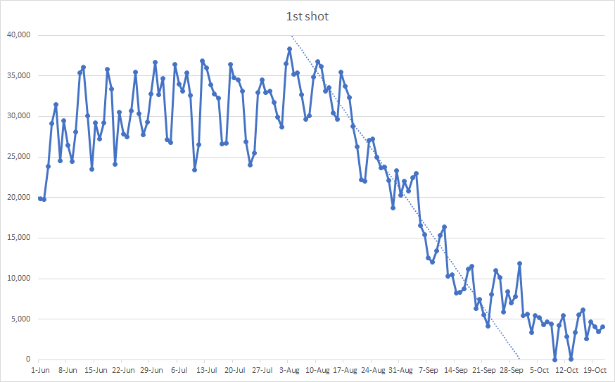
Nonetheless, visualizing data is fun. Like seeing how the daily vaccination number would drop
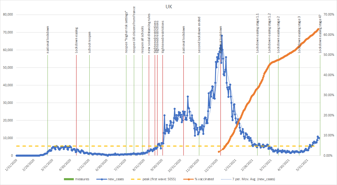
Or seeing how the vaccine had worked quite well
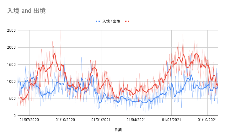
However, seeing how people fled for their future is sad
Anyway, as people are adapting the new normal
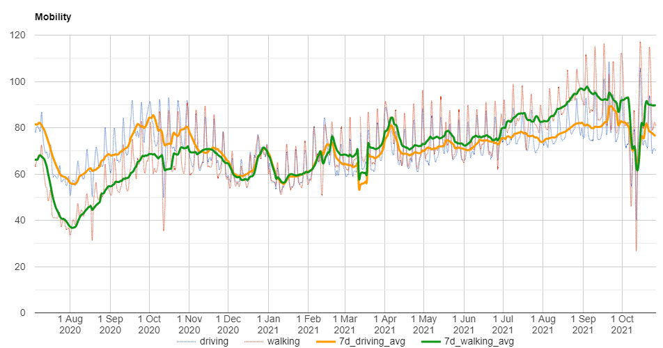
It's time to say goodbye
In fact, it is pretty accurate to predict the trend using the data before 4 May for India as the government did not have any measures to stop the virus.

I stopped tracking everything as I knew vaccine will change everything and it is rather meaningless to report the numbers (just like we don't really care how many people are getting flu). Others are might not have time as people are starting to work in office again.
Nonetheless, visualizing data is fun. Like seeing how the daily vaccination number would drop

Or seeing how the vaccine had worked quite well

However, seeing how people fled for their future is sad

Anyway, as people are adapting the new normal

It's time to say goodbye

You have mis-interpreted the Gaussian curve you got. The Gaussian distribution cannot predict the development of the pandemic. First of all, the Central Limit Theorem does not proved that the statistics is a normal (Gaussian) distribution. This theorem just help us understand why so many statistics happened in the real world appear to obey the Gaussian distribution. If you look at the actual data of the new cases and new deaths in many countries, you will find that a lot of curves have a long tail after a wave. So, the distribution is not a Gaussian, only the interesting parts of the curve look close to a Gaussian curve.
Even the distribution is really a normal (Gaussian) distribution, you are still not predicting anything. This is because you need to know the mean and the standard deviation of the Gaussian distribution to determine the actual Gaussian curve. However, we don't know the mean and the standard deviation; we only know the mean and the standard deviation after we know most of the data. When you add more and more data to try to fit the curve, you reduce the range of the possible Gaussian curves. However, only when the wave of new cases has reached the peak and has went down enough, we can then fix the vaules of the mean and the standard deviation. In other words, you can determine the actual Gaussian curve only after you know the answer. This is not prediction or forecast. You just use the Gaussian curve to express something we already known. So what you said about using the Gaussian curve to predict what happened in India is wrong.
Even the distribution is really a normal (Gaussian) distribution, you are still not predicting anything. This is because you need to know the mean and the standard deviation of the Gaussian distribution to determine the actual Gaussian curve. However, we don't know the mean and the standard deviation; we only know the mean and the standard deviation after we know most of the data. When you add more and more data to try to fit the curve, you reduce the range of the possible Gaussian curves. However, only when the wave of new cases has reached the peak and has went down enough, we can then fix the vaules of the mean and the standard deviation. In other words, you can determine the actual Gaussian curve only after you know the answer. This is not prediction or forecast. You just use the Gaussian curve to express something we already known. So what you said about using the Gaussian curve to predict what happened in India is wrong.
161 new cases in New Zealand
New national record!
New national record!
Furthermore, your Gaussian curve shown above begin to show its failure near the end when the long tail takes over.
Notice that one cannot ignore the long tail by saying that it is a small number. This small number is over 15,000 new cases every day in India. So even you have used such a late data to fit your Gaussian curve, your Gaussian still predicts incorrectly.
Notice that one cannot ignore the long tail by saying that it is a small number. This small number is over 15,000 new cases every day in India. So even you have used such a late data to fit your Gaussian curve, your Gaussian still predicts incorrectly.
World
Coronavirus Cases:
246,759,134
Deaths:
5,004,474
According to Worldometers, we have surpassed 5 million deaths!
4,248 new cases and 16 new deaths in Singapore
Still worsening.
Still worsening.
This is an example of how strong the people who hate this 國際疫情討論區 have helped us to push this 國際疫情討論區.
During late 國際疫情討論區06 or early 國際疫情討論區07, someone showed his/her incorrect value of death rate. We told him/her tha value was wrong and he/she defended the value.
In last than 2 hours, there were almost 300 replies.
Recall that the maximum length of a post in LIHKG is 5000 replies.
If the speed was kept going, we could finish a post in 1 day.
I really wonder whether this also happened at 國際疫情討論區01 to 04 so that they could be finished at such a short time.
Not every one of them are so helpful. For example, some people left this kind of comment:
Wuhan virus help to cleansing the old people.
We just ignored or blocked these people.
26,870 new cases and 648 new deaths in Ukraine
The worst since the start of the pandemic.
The worst since the start of the pandemic.
40,251 new cases (new national record) and 1,160 new deaths in Russia
The worst since the beginning of the pandemic.
The worst since the beginning of the pandemic.
6,102 new cases and 12 new deaths in Austria
Keep worsening.
Keep worsening.
Tonga reports first COVID-19 case
The island nation of Tonga reported its first COVID-19 case Friday after a traveler flying to the country tested positive.
Tonga is only one of a handful of countries that had reported no COVID-19 cases. Its isolation as a small island in the southern Pacific Ocean has allowed to it to remain unscathed during the pandemic.
The vaccinated traveler from New Zealand arrived from Christchurch on Wednesday and had been quarantining at a hotel. They tested negative before arriving in Tonga.
第 1 頁第 2 頁第 3 頁第 4 頁第 5 頁第 6 頁第 7 頁第 8 頁第 9 頁第 10 頁第 11 頁第 12 頁第 13 頁第 14 頁第 15 頁第 16 頁第 17 頁第 18 頁第 19 頁第 20 頁第 21 頁第 22 頁第 23 頁第 24 頁第 25 頁第 26 頁第 27 頁第 28 頁第 29 頁第 30 頁第 31 頁第 32 頁第 33 頁第 34 頁第 35 頁第 36 頁第 37 頁第 38 頁第 39 頁第 40 頁第 41 頁第 42 頁第 43 頁第 44 頁第 45 頁第 46 頁第 47 頁第 48 頁第 49 頁第 50 頁第 51 頁第 52 頁第 53 頁第 54 頁第 55 頁第 56 頁第 57 頁第 58 頁第 59 頁第 60 頁第 61 頁第 62 頁第 63 頁第 64 頁第 65 頁第 66 頁第 67 頁第 68 頁第 69 頁第 70 頁第 71 頁第 72 頁第 73 頁第 74 頁第 75 頁第 76 頁第 77 頁第 78 頁第 79 頁第 80 頁第 81 頁第 82 頁第 83 頁第 84 頁第 85 頁第 86 頁第 87 頁第 88 頁第 89 頁第 90 頁第 91 頁第 92 頁第 93 頁第 94 頁第 95 頁第 96 頁第 97 頁第 98 頁第 99 頁第 100 頁第 101 頁第 102 頁第 103 頁第 104 頁第 105 頁第 106 頁第 107 頁第 108 頁第 109 頁第 110 頁第 111 頁第 112 頁第 113 頁第 114 頁第 115 頁第 116 頁第 117 頁第 118 頁第 119 頁第 120 頁第 121 頁第 122 頁第 123 頁第 124 頁第 125 頁第 126 頁第 127 頁第 128 頁第 129 頁第 130 頁第 131 頁第 132 頁第 133 頁第 134 頁第 135 頁第 136 頁第 137 頁第 138 頁第 139 頁第 140 頁第 141 頁第 142 頁第 143 頁第 144 頁第 145 頁第 146 頁第 147 頁第 148 頁第 149 頁第 150 頁第 151 頁第 152 頁第 153 頁第 154 頁第 155 頁第 156 頁第 157 頁第 158 頁第 159 頁第 160 頁第 161 頁第 162 頁第 163 頁第 164 頁第 165 頁第 166 頁第 167 頁第 168 頁第 169 頁第 170 頁第 171 頁第 172 頁第 173 頁第 174 頁第 175 頁第 176 頁第 177 頁第 178 頁第 179 頁第 180 頁第 181 頁第 182 頁第 183 頁第 184 頁第 185 頁第 186 頁第 187 頁第 188 頁第 189 頁第 190 頁第 191 頁第 192 頁第 193 頁第 194 頁第 195 頁第 196 頁第 197 頁第 198 頁第 199 頁第 200 頁第 201 頁