LOGO既歷史...好癲...
 http://aeriverse.com/threads/history-of-exos-logos.3943/

Their original logo from when they first debuted
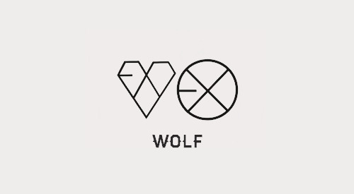
1st full album logo XOXO (Wolf, Growl)
Especially making their logo out of a heart shape looks really refreshing
EXO’s first christmas album logo at the top expresses a snowflake
The following year is ‘Overdose’ album
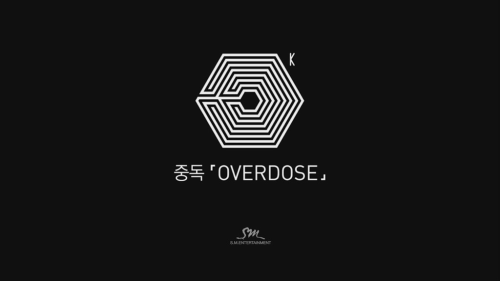
‘Falling into a fatal love and being unable to escape the woman you love’ A maze shaped logo that fits the description of the song
That year after two members left the group, this was the new logo released at an year-end award show
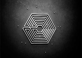
2 out of 12 (the original number of members) were still trapped inside the maze = the two members who left. It was to the point where ridiculous stories like ‘I bet SM planned the departures’ surfaced
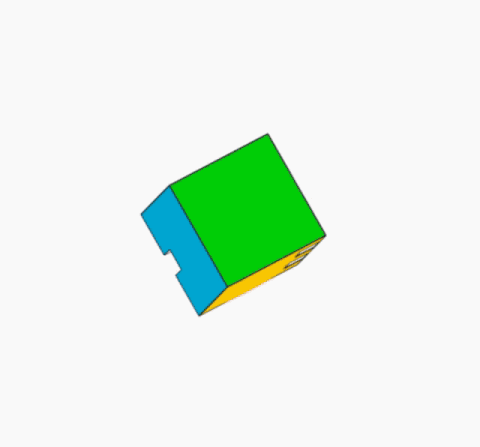
One year later, the release of their 2nd full album


With 4 squares, it formed 6 flat faces. As the cube turned and stopped at a certain point, that’s how EXO’s logo was formed. Over here the square represents the 4 members (EXO-M), 6 flat faces represent 6 members (EXO-K). This cube consists of being able to go back. In 3D form the cube has 12 edges but when looking at it in 2D form the number of edges reduced to 10, completing the logo
Transformation of logo using a cube (everytime I see it I get amazed)
3rd full album
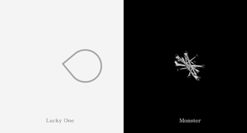
Lucky One: 4 leaf clover
Monster: Bones
Both match the atmospheres of the songs
2016 winter album logo
Snowflake-shaped ice -> melts (when I look at it I get amazed)
If you look at EXO’s logos, it seems like they change the shape every time but they maintain the shape for the winter albums
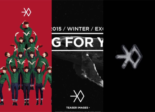
(from left) 2013-2015-2016
That snowflake shape seems to be a symbol
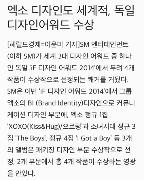
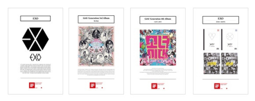
[news article] ‘EXO’s design is also world-class, wins design award in Germany’
…SM receives award in the communication category at the ‘iF Design Awards 2014′ with EXO’s BI (brand identity) […] in the packaging design category, EXO’s first full album ‘XOXO(Kiss&Hug)/Growl’ was awarded…
They even got an award for designing. It’s impossible not to care about the design in the agency
+ EXO’s first unit EXO-CBX’s logo
EXO/CBX
EXO-CBX’s form when lying vertically

The unit logo also matches the unit’s identity, it’s really well-made


 個logo
個logo


 講左咁耐你班痴線佬都唔補圖


